Building Charts
Charts enable you to display data, individually or grouped together. You can build three types of charts:
- Scatter
- Line
- Bar
Add charts
To add a chart to your dashboard:
- Select "+" from the dashboard header. The STORE appears.
- From the STORE, select Charts. The CHARTS STORE DASH appears.
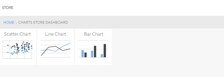
- Select the type of chart you want to build. The ADD NEW <type of chart> pop-up appears.
- Follow the steps below for your type of chart:
Build a Scatter Chart
To build a Scatter Chart, select and update the elements in the ADD NEW SCATTER CHART pop-up:
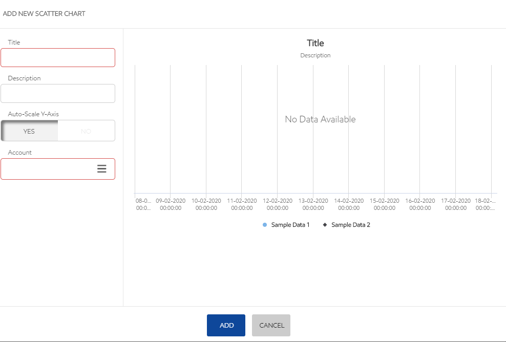
- Add a Title and Description to your chart.
- Choose if you want to auto-scale the chart Y-Axis. (The X-Axis is determined by the Date Range Selector.)
If you choose NO, enter the minimum and maximum values for the chart Y-Axis.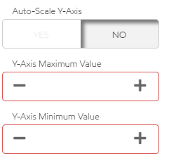
- Select an account from the Account list.
- Select the data elements to populate the chart from the Data Elements list.
To ease identification, data elements display the KPI, a Description, and the unit of measure. - When you have finished building your scatter chart, click ADD to place it on your dashboard, or click CANCEL to delete the chart.
Note: The completed chart is added to your dashboard in the next "open" location from upper-left to bottom-right. Use the directions in 850428106 to adjust the placement on your dashboard.
Build a line chart
To build a line chart, select and update the elements in the ADD NEW LINE CHART pop-up:
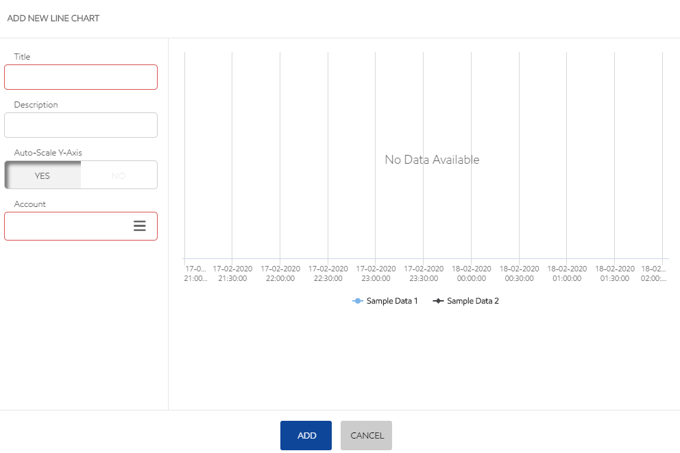
- Add a Title and Description to your chart.
- Choose if you want to auto-scale the chart Y-Axis. (The X-Axis is determined by the Date Range Selector.)
If you choose NO, enter the minimum and maximum values for the chart Y-Axis.
- Select an account from the Account list.
- Select the data elements to populate the chart from the Data Elements list.
To ease identification, data elements display the KPI, a Description, and the unit of measure. - When you have finished building your line chart, click ADD to place it on your dashboard, or click CANCEL to delete the chart.
Note: The completed chart is added to your dashboard in the next "open" location from upper-left to bottom-right. Use the directions in 850428106 to adjust the placement on your dashboard.
Build a bar chart
To build a bar chart, select and update the elements in the ADD NEW BAR CHART pop-up:
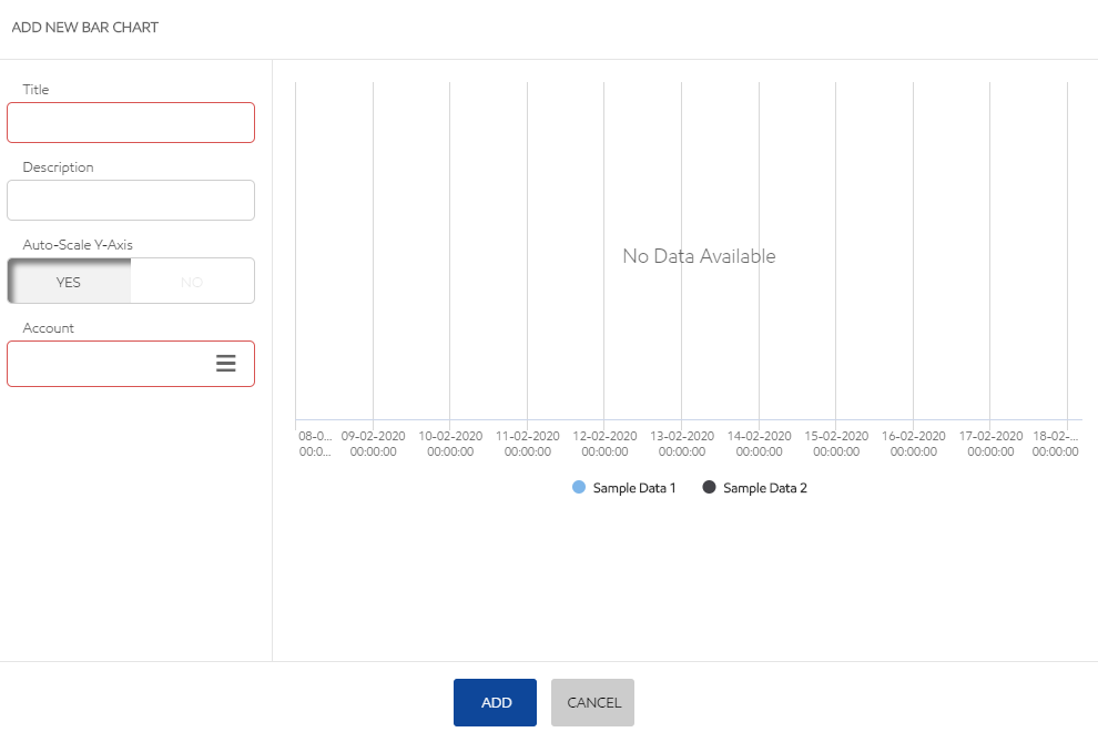
- Add a Title and Description to your chart.
- Choose if you want to auto-scale the chart Y-Axis. (The X-Axis is determined by the Date Range Selector.)
If you choose NO, enter the minimum and maximum values for the chart Y-Axis.
- Select an account from the Account list.
- Select the data elements to populate the chart from the Data Elements list.
To ease identification, data elements display the KPI, a Description, and the unit of measure. - When you have finished building your bar chart, click ADD to place it on your dashboard, or click CANCEL to delete the chart.
Note: The completed chart is added to your dashboard in the next "open" location from upper-left to bottom-right. Use the directions in 850428106 to adjust the placement on your dashboard.
Related articles