FAQ
Unit Monitoring FAQ
Q: Why is my index score a different color than the bands below it? And what does it mean?
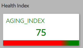
A: The bands below is a relative representation of number of KPI for an index that are inside or outside of thresholds. For example, if you have 4 KPI that impacts Aging Index and 2 of the KPIs are operating outside of range. Then the band below the health index will how as 50% red.
Additional Info: We are working through a more intuitive Operational Index. We started with the notion of a Performance Index that could have variable weighting on what drives the health of a given group of data. We found this to be more complex than anticipated and are deferring this feature in the interest of time. Instead, we are prioritizing work to support an Operational Index. This both serves to help troubleshoot and navigate the data hierarchy by illustrating at a glance what is good and what is not. However, it is not ready. The current Performance Index is not perfect, and we made the conscious decision to not invest more time in the fix. As a result, you may see some “funny” values in the short term.
Q: How do I adjust the Min or Max setting of the threshold for a specific KPI?
A: The thresholds for KPIs are pre-set by ExxonMobil engineers based on unit operating design and operating history. If you would like to adjust a specific KPI, please contact your ExxonMobil technical support team.
Q: How do I go backwards after drilling down the KPI hierarchy?
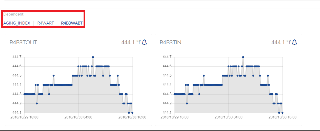
A: Use the bread crumbs found at the top of the dependents section. Each value is a hyperlink.
You can also click on a previously saved favorite to jump to another KPI.
Q: How do I bookmark a favorite?
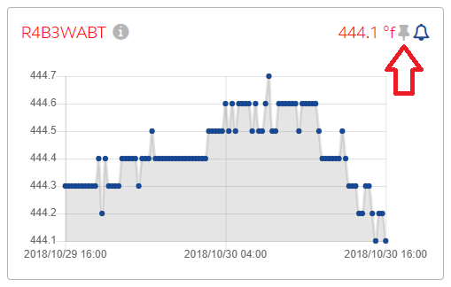
A: Simply select the pin icon on any KPI card.
Q: How do I remove a favorite?
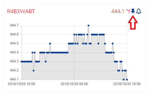
A: Just select the pin icon in the favorite KPI card to toggle it off.
Q: How do I change the time frame I am viewing?

A: Navigate to the “Time Range” section in the header on the left-center. Choose a typical range from the drop down box, or select the customize hyperlink for a more specific value. If the "From Last" box is checked, the data will automatically display specified time range until the last data is available.
Q: Why does viewing a collaboration entry open a new tab?
A: The system has saved the original data parameters with the collaboration entry. Opening a new tab allows for an exact replica of that filter criteria without affecting your current view.
Q: Can I delete a health index card?
A: No. Current design intends for these indexes to serve as the root of any investigation or drill down. These are designed by ExxonMobil as the key monitoring parameters for your Unit. If you would like to modify these, please contact us to discuss.
Q: Can I interact with the scatterplot directly?
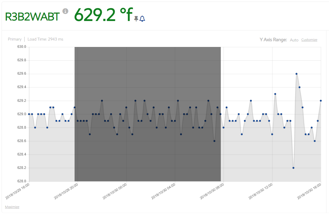
A: Yes. You can do a number of things:
- Select a data point and see the raw data in the data tab.
- Zoom in on a narrower data window by selecting a data point and dragging the mouse cursor to another data point. This will trigger a refresh of the timeframe to start and end with the left and right data points you selected.
- Zoom in on the chart by selecting the “Maximize” hyperlink on the bottom left. Go back by clicking “Minimize”.
Q: Can I view multiple data elements simultaneously?
A: Not yet. That feature is on our roadmap.
Q: Can I view the entire data hierarchy at once?
A: Not yet. Displaying a complete site view of the data for non-linear navigation (i.e. jumping) is on our roadmap.
Q: Why is the dependency health ribbon partially or completely gray?
A: Not all KPI’s have a clear operating envelope. These KPIs without thresholds will be represented as gray or neutral. A future release will simplify to be binary (good or bad, green or red).
Q: Can I get emails when a KPI alert is triggered?
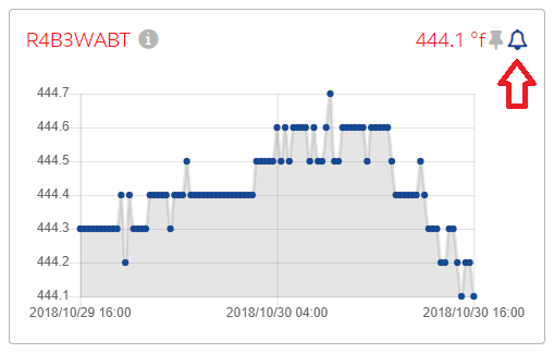
A: Yes. Subscribe to email alerts by selecting the alert bell icon on the KPI card. Click it again to unsubscribe. Please note, this feature is not active yet. We will release this in a future date.
Q: How can I adjust the y-axis?
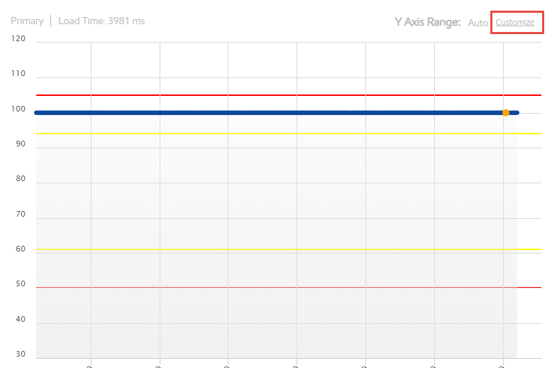
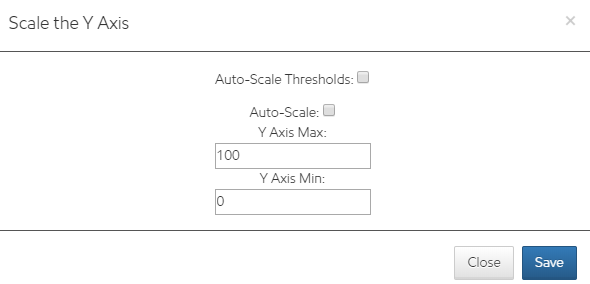
Adjust the Y-axis by using the Customize button on the top right corner of the main chart. Once you save a customized y-axis, the changes apply to all subsequent main charts you select. The Customize will give you the option to Auto-Scale, Auto-Scale Thresholds, or Customize (both auto-scale option unchecked)
Q: When I ask for less than a week of data, I get 15-minute snapshots. When I ask for more than a week, I get daily averages. Why?
A: This feature was deliberate to improve system performance. Today, the system will automatically make that switch for you. In the future, we will give you even more flexibility to decide when to aggregate for performance.
Q: What are my options for loading process historian data?
A: There are 4 options:
- E-Mail: File attachment and unique ID enclosed in <> on the subject line does the job.
- SFTP: Leverage this secure protocol to push data to a designated staging area.
- RESTful API (HTTPS): Same as SFTP, just a different protocol.
- Manual Upload: Direct interaction with the web interface.
Notes:
- Expectation is file format is a standard CSV with first row containing comma separated field names.
- Preference is to automate options 1-3 via an agreed upon batch window to ensure consistency of data availability.